
Packed Bar Charts - Analytics Forward Talk
‘Too Many Bars?’ was the title of the talk given by Xan Gregg at yesterday’s Analytics Forward conference. Below are my notes with some examples from a blog post Xan wrote on Packed Bar Charts.
I have had this problem before, notably when attempting to display site search result counts, where the data is highly skewed to a few highly used terms. It is tricky to show the full context that there are 10,000 words being searched by our customers, here are the 50 that matter.
Xan of JMP software implemented an interesting solution.
Question: What if we displayed the top results in a traditional bar chart, then filled the rest of the area like a heatmap, maintaining the original axis scale for the heatmap component?
Answer: I like it. When explaining to business users it allows me to display the full data set in a single visualization. Frequently a stakeholder gets a specific term stuck in their head. That this one keyword is critical to the success of them selling products. With a packed bar display, it is instantly apparent how that term ranks in the full scale of the words searched.
Minor downside for me. While there is an R package for packed bar charts based on plotly. I don’t see a way to do it in Python yet. Hopefully Xan’s talk yesterday inspired somebody to implement it.
These are my notes from his talk, I may have missed something important, please refer to the links for accuracy
When too many categories Bar Charts frequently end up too crowded.
How can you display all the categories without losing the information?
Frequently end up zooming in on only one portion of the data, throwing out the others.
To avoid throwing out the others completely, The rest can be grouped into ‘OTHER’ but this will sometimes swamp the other bars, blowing out the scale.
Focus plus Context - instead of layers
- Central element with labels
- additional data needs mouseover/hover to get the data.
Can you use a Treemap instead?
- Still focus and concept
- Label the top 10 or so
- Good because it gives a good feel for the whole picture
- Minus is that it is a shift to area, a less good way to show differences.
Pack Bubbles
- See a lot in the media
- More fun
- Even harder to determine size
- Packing leaves white spaces
Dot Plot
- Similar to bar Chart
How about packed bars?
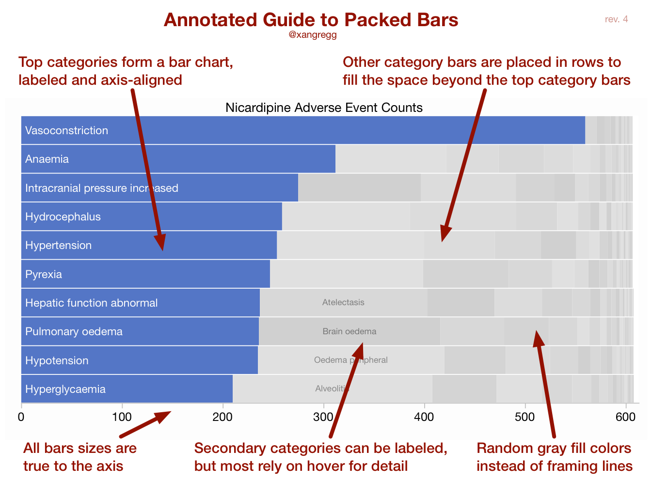
- Like a hybrid between bar and Treemap
- No info lost, still focus on the top 10
- Gives context for the whole spaces
- Can layer in heatmaps and gradients to add another dimension
- Looks similar to stacked bar chart
Implementations other than JMP
- R packed bars
- Excel package by Jon Peltier
- D3
- Chubuk.js
What about when the data is less skewed?
- On packed bars it is just a grid. No advantage to the display
Additional Reading:
- Get to the bottom start at the next column
- Also good for skewed data
- Less context, but still on the screen
- Little bit of 3d shading
- Small ones are close to the x axis
- Better with normal distribution
- Lots of noise
- Similar to a scatterplot
- Better with a normal Distribution
NYC Dog Names data - what motivated Xan to create packed bars in the first place.